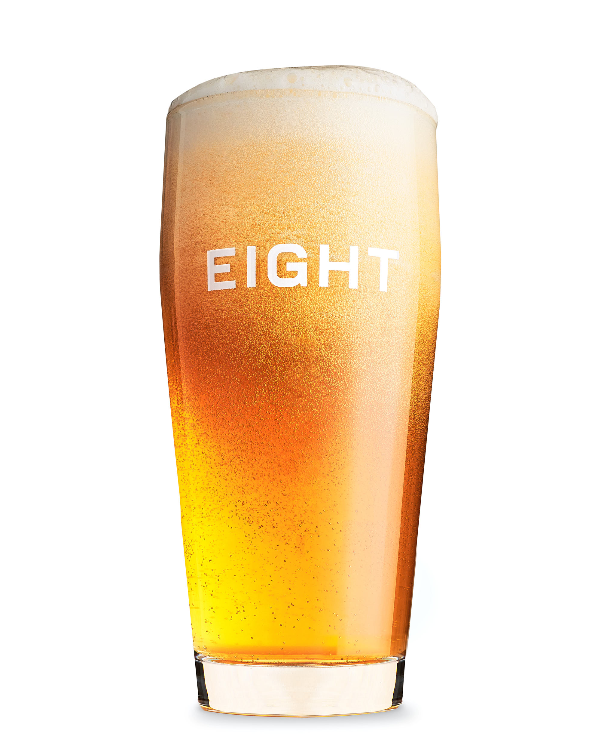
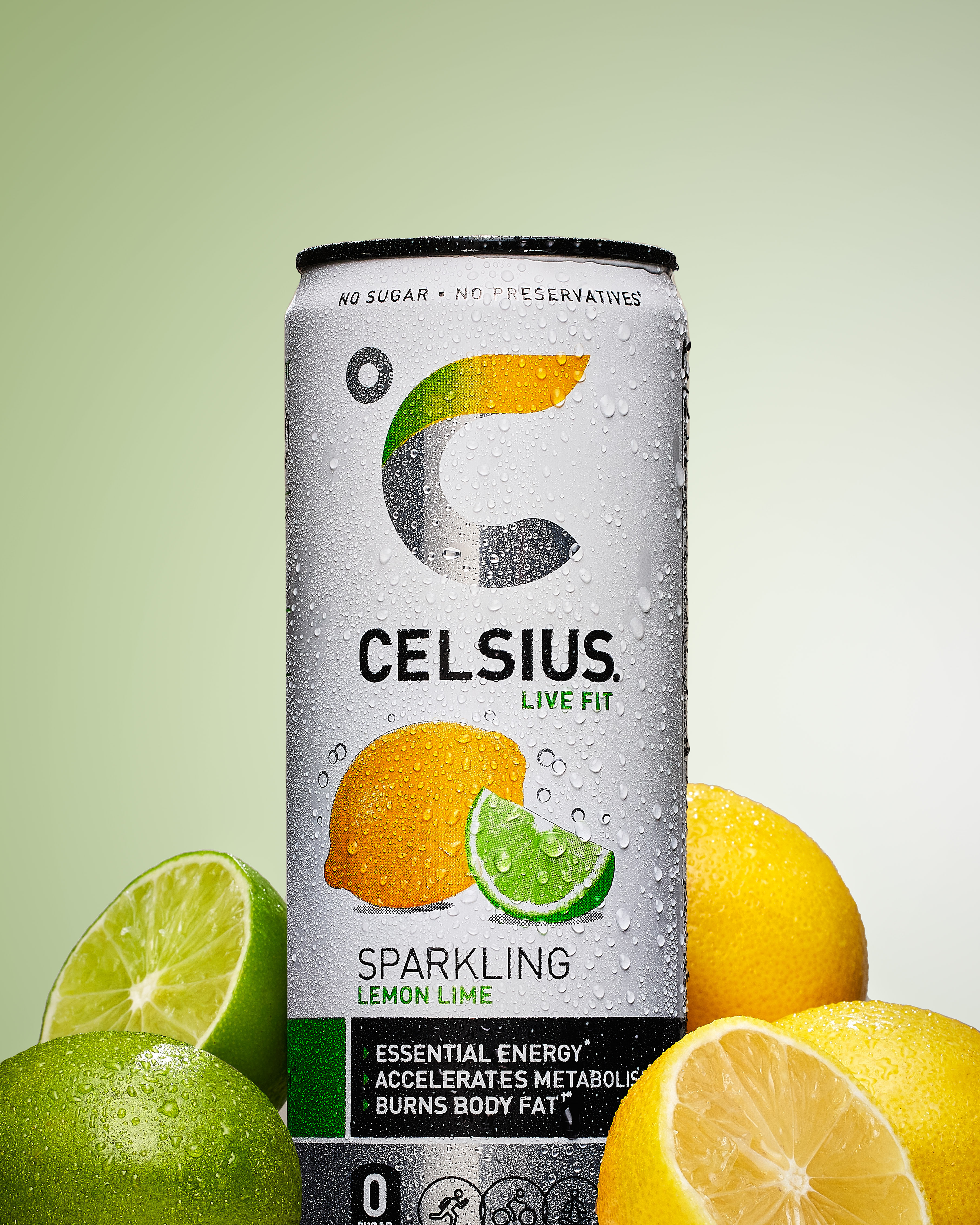
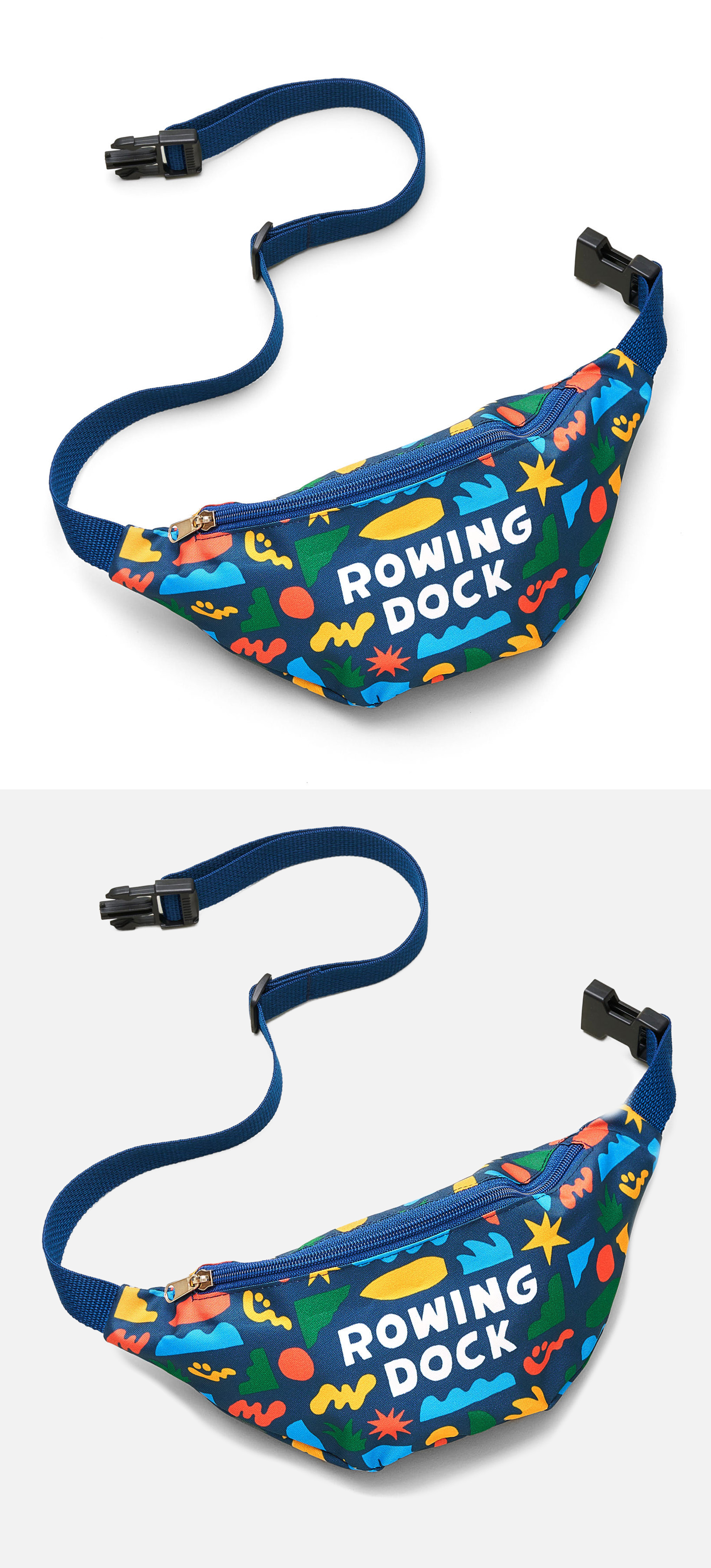

Where will these images live?
Most of the time, choosing between white-background and styled photos isn't a hard decision. It comes down to one question: where are these images going to live, and how will people use them? Answer that, and the right format is usually obvious.
Need to show shoppers exactly what your product looks like on a store page? That's clean e-commerce work — the product on a white or simple background, shot to show every color, angle, and detail. Trying to make someone feel something in an ad? That's styled work. Nine times out of ten a brand just needs accurate website images first, and the fancier stuff comes later, if at all.
White background sells the facts
White-background shots show your product clearly, with accurate color and every angle a buyer studies before they commit. This is the workhorse of any online store — the image that answers "what exactly am I getting." It's also the most efficient work to produce: the setup is clean and repeatable, so once it's dialed in you can move through a whole catalog. That's why I tell most clients on a budget to start here.
White doesn't mean boring or cheap. I worked with Wolves Call, a luxury handbag line whose designer wanted a high-end look without a styled set. We shot everything on a clean, slightly off-white background with natural shadow, bags photographed open and hanging, color held precisely accurate to the leather. It looked elegant and expensive without a single prop.
Styled work sells a feeling
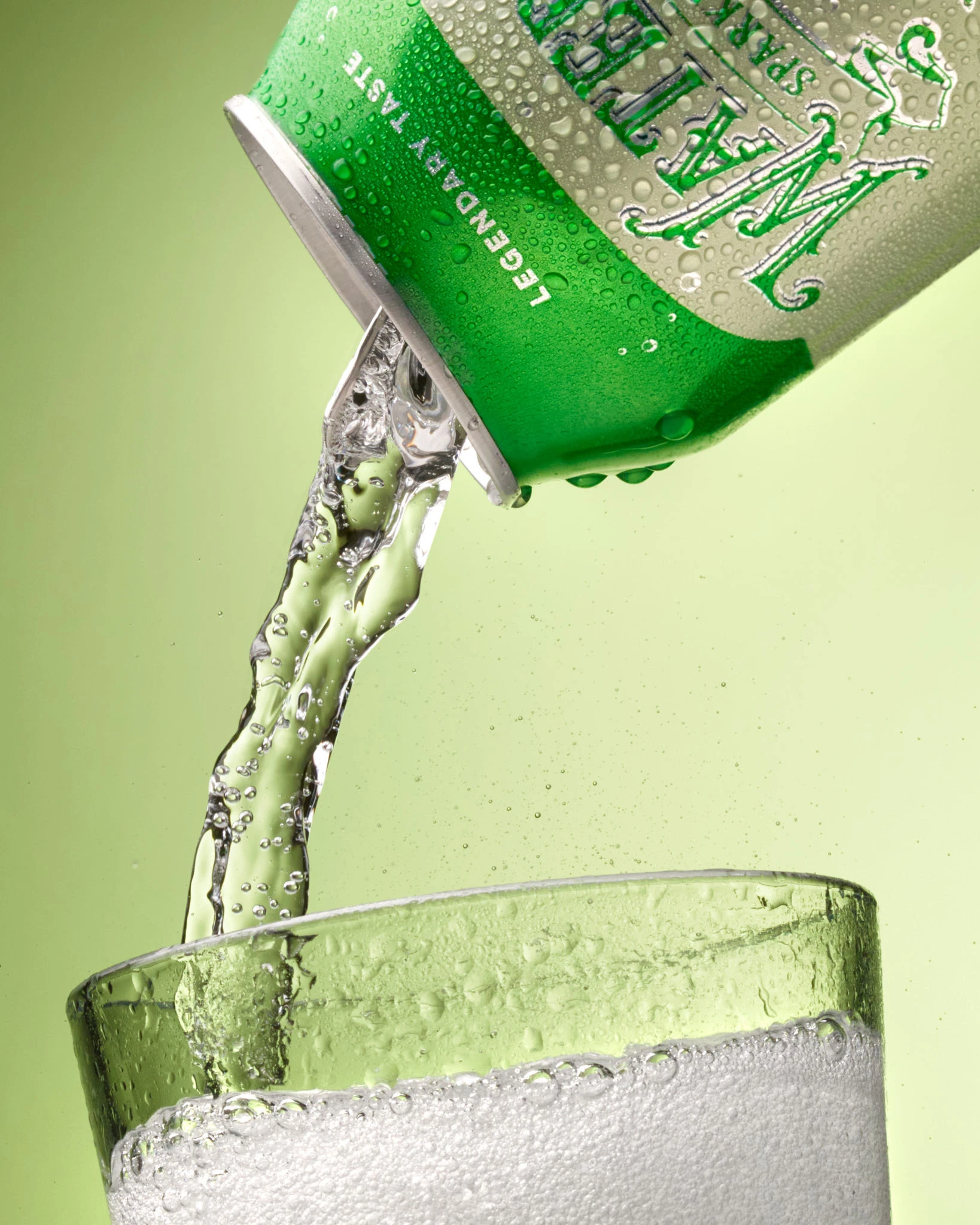
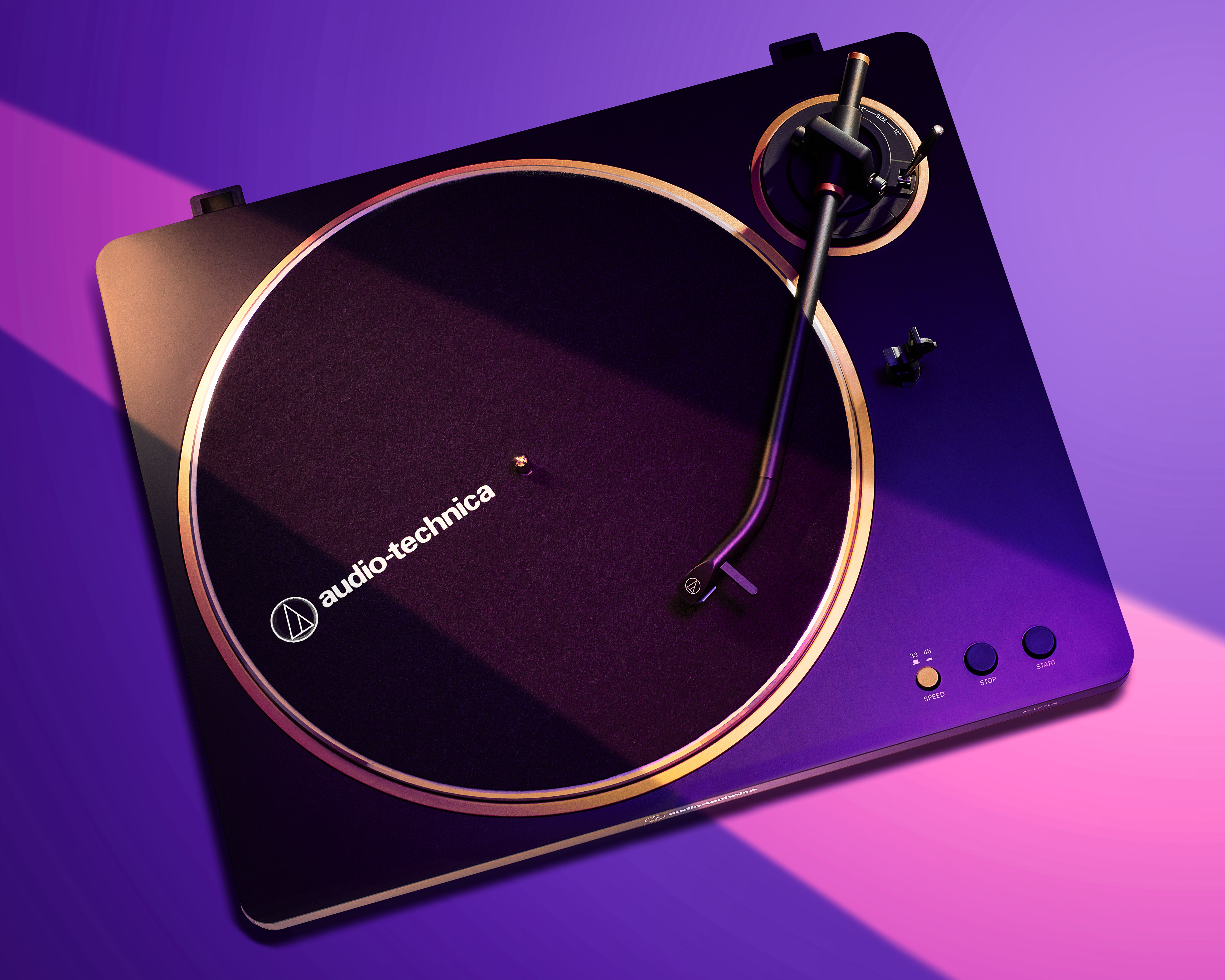
Instead of just documenting the product, lifestyle work shows it in the life your buyer wants — or solving the problem they're trying to fix. This is the hero shot in a magazine, the billboard, the photo with light and mood built to make someone want the thing before they've read a word. You see it anywhere the goal is emotion rather than information: advertising, social campaigns, a homepage banner that has to stop the scroll.
The honest caution: don't let anyone talk you into an all-styled shoot for a simple product before you need it. Styled images are powerful when there's a real campaign behind them. Spend there when you're ready to market, not before.
The plain shots earn the sale. The styled shots build the brand.
This isn't really an either-or. Most brands need white-background shots as the foundation for selling, plus a smaller set of styled hero images to anchor the page and carry the marketing. Take TUMLOVE, a gut-healthy protein brand I worked with — he came to me mostly needing clean white-background shots, with a couple of lifestyle frames. The white-background images were the workhorse that sold the product online.
But the styled images we added — the powder mixed in a glass on a countertop, an overhead flat-lay with his brand colors worked in — are what he actually built his first year of marketing around. So if your budget is tight, start with accurate white-background work and add styled images as the results justify it. If you're launching a campaign, plan for both from the start.
Know the image rules first
Amazon is strict, and its software auto-flags anything off-spec. The main image has to be the product on pure white, filling ~85% of the frame, with no logos, text, or props. Get it wrong and the listing gets rejected.
Category rules trip people up too — footwear as a single angled shoe, jewelry without props, apparel on a model or ghost mannequin. The pure-white part is harder than it sounds: you can't just blast the background bright, or the product's highlights blow out.
Consistency is the job
Your own store has no gatekeeper, so the challenge isn't compliance — it's consistency. If one shot is on clean white and the next is even slightly off, the mismatch reads as unprofessional and quietly costs you trust.
The upside is freedom: you can run the hero and stylized work Amazon won't allow in the main slot — a dramatic background, an interesting lighting effect, real mood. The trick is holding a consistent look across the whole set so it feels like one brand.
"White" is rarely white
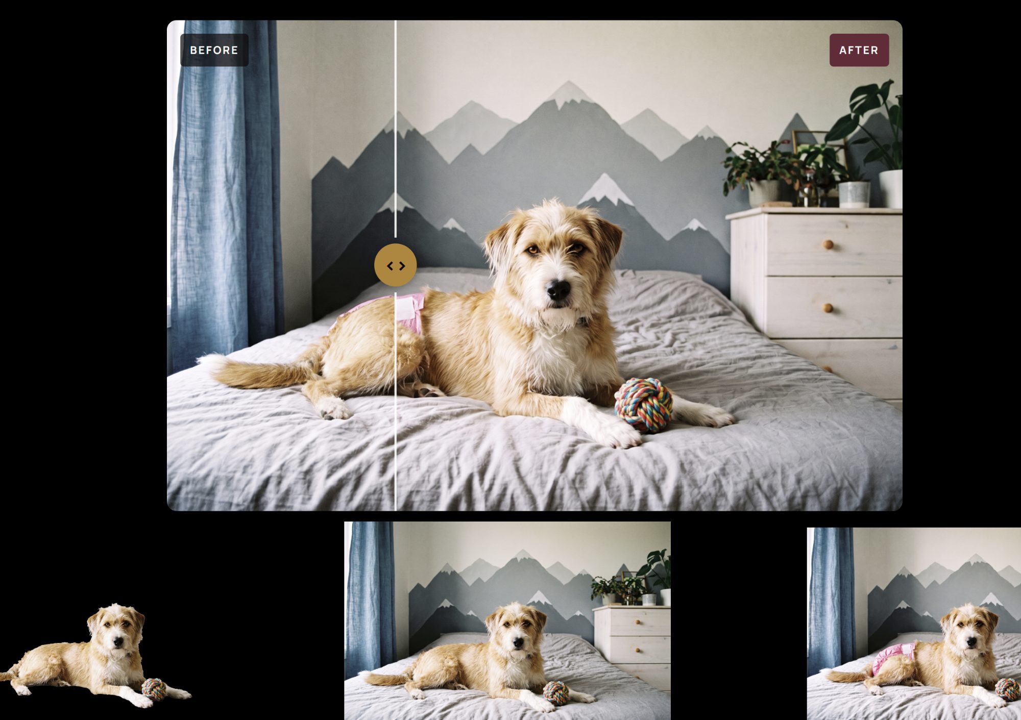
A lot of brands try this themselves first — nothing wrong with that. But most DIY setups use a small lightbox, and what looks white on screen is usually a dull gray you don't notice until it's next to a truly white image. You can't fix it by cranking the brightness; the real solution is technique — softening and spreading the light so the background reads bright white while the product keeps its detail.
Then multiply that across ten, fifteen, twenty products that all have to match. Add the scratches, dust, and fingerprints that show up on anything reflective, and cleanup eats hours. It's like a plumbing job — handle some yourself, but once you're past about ten products, your own time usually costs more than hiring it out.
Tell me about your product and where the images are going to live, and I'll point you to the right mix.
Frequently asked questions
It depends on where they'll appear. Amazon and most marketplaces require a true pure-white main image, so there you have no choice. On your own website, a very slightly off-white background often looks better, because pure white can blend into a white page and lose the product's edges. A hint of tone keeps it defined and can read more premium.
No. Amazon's main image has to be the product alone on pure white, with no props, text, or scenery — a styled shot will get the listing flagged. The good news: you can use lifestyle and styled images in the secondary slots, where they help shoppers picture the product in use.
Partly. Your clean white-background shots work everywhere — Amazon, Shopify, social. Where it splits is the creative work: Amazon won't allow a styled hero in the main slot, but your own site welcomes it. The efficient approach is to shoot the white-background set that works everywhere, then add the styled images your website and ads can use freely.
Almost always, yes. Even the most lifestyle-driven brands need clean, accurate shots somewhere — product pages, spec sheets, retail partners, or marketplaces that require them. Styled images sell the feeling, but at some point a buyer wants to see exactly what the product looks like before they commit.
Sometimes, for a brand-new store finding its feet. But a small lightbox usually produces a grayish background rather than true white, and phone shots struggle with reflective or detailed products and with staying consistent across a full catalog. Once you're scaling or selling on a strict marketplace, the time and rework usually outweigh the savings.
Yes, and combining them is often the smartest use of a budget. When I have a product set up and lit, it's efficient to capture the clean images your store needs and then build a few styled frames from the same session. Planning both up front, rather than booking two shoots, saves setup time and keeps the look consistent.
Mark Bowers is a commercial product photographer based in Austin, TX, working with consumer-goods brands and agencies on catalog, e-commerce, and campaign imagery. He operates as Thunderbolt Commercial Photography, LLC — shooting product stories built to move units.